
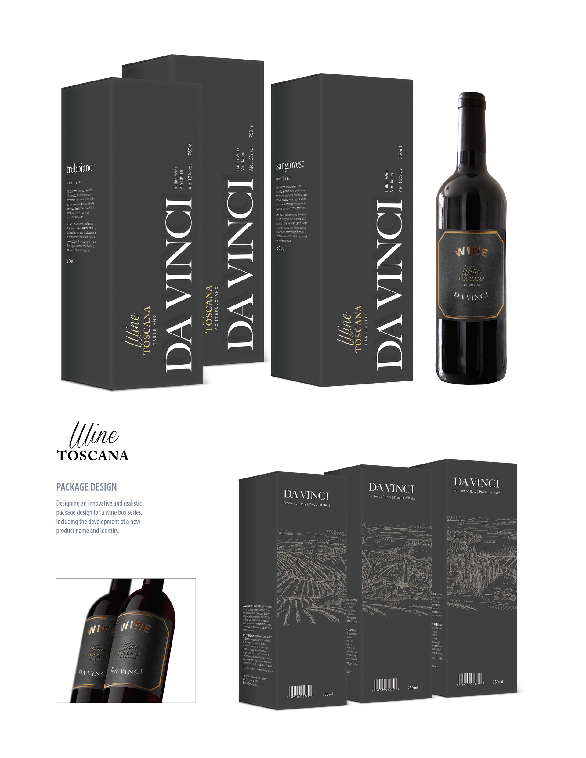
Around the world there are more than 10.000 varieties of wine grapes. Many of them more popular in certain countries than others. Therefore, the package of Tuscan wine focuses on being eye-catching, radiating high quality and highlighting the unique feature of presenting the best selection from Italy to Canadian stores.
The reasoning behind choosing the name, Da Vinci, plays on its relationship to one of the greatest artists of all times, indicating that Wine Toscana has the same quality and reputation among wines and is the go to for everyone who wants to experience a piece of elite Italy. The name Da Vinci also means as much as “winning” or “to win”, representing that Wine Toscana is the number one among Italian wines.
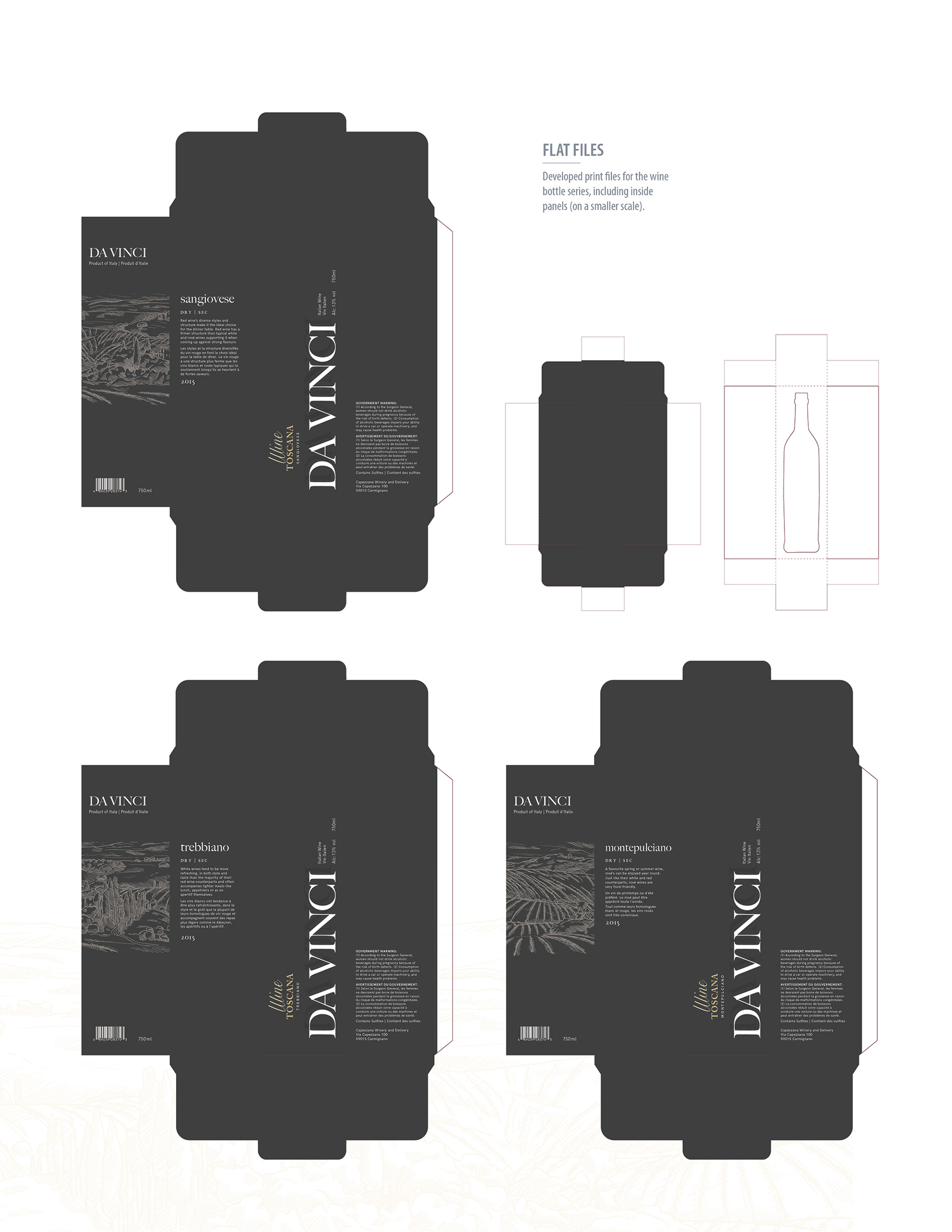
To maintain the elegance throughout the layout, the structure is clean and simple, keeping text elements to the minimum. The colour range, white to grey, was also chosen accordingly, with the intention on using white additionally as an attention-grabbing element. The chosen typefaces are representing elegance and simplicity, while maintaining legibility from far away.
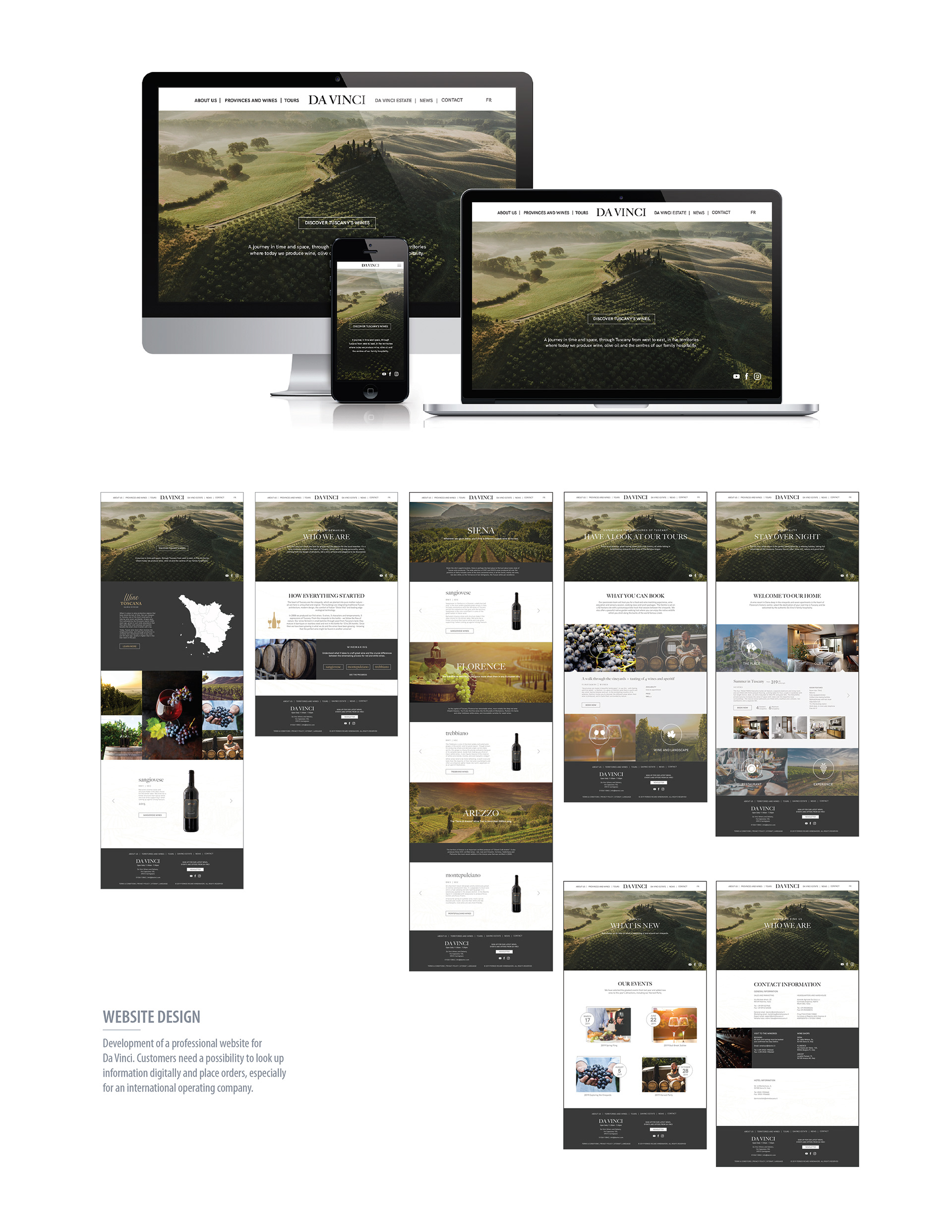
The package design of the wine bottles reflects high quality and should convey to the customer the feeling of buying a unique treasure from Italy. However, a professional website is mandatory especially for an international operating company. When designing the website, I went with a simple and clean structure and enough negative space to maintain the elegance coming from simplicity throughout the layout. The body copy was reduced to a minimum of mandatory information and the website design rather focused on imagery to make the website more engaging. The colour scheme was based on the package design; usage of grey and white to provide the design with an elegant balance with a touch of gold to enhance the luxurious aspect. To reduce the amount of body copy and make the website more engaging, I incorporated many clickable buttons leading to further information for customers who are interested. The chosen typefaces are representing elegance and simplicity, while maintaining legibility on any screen.