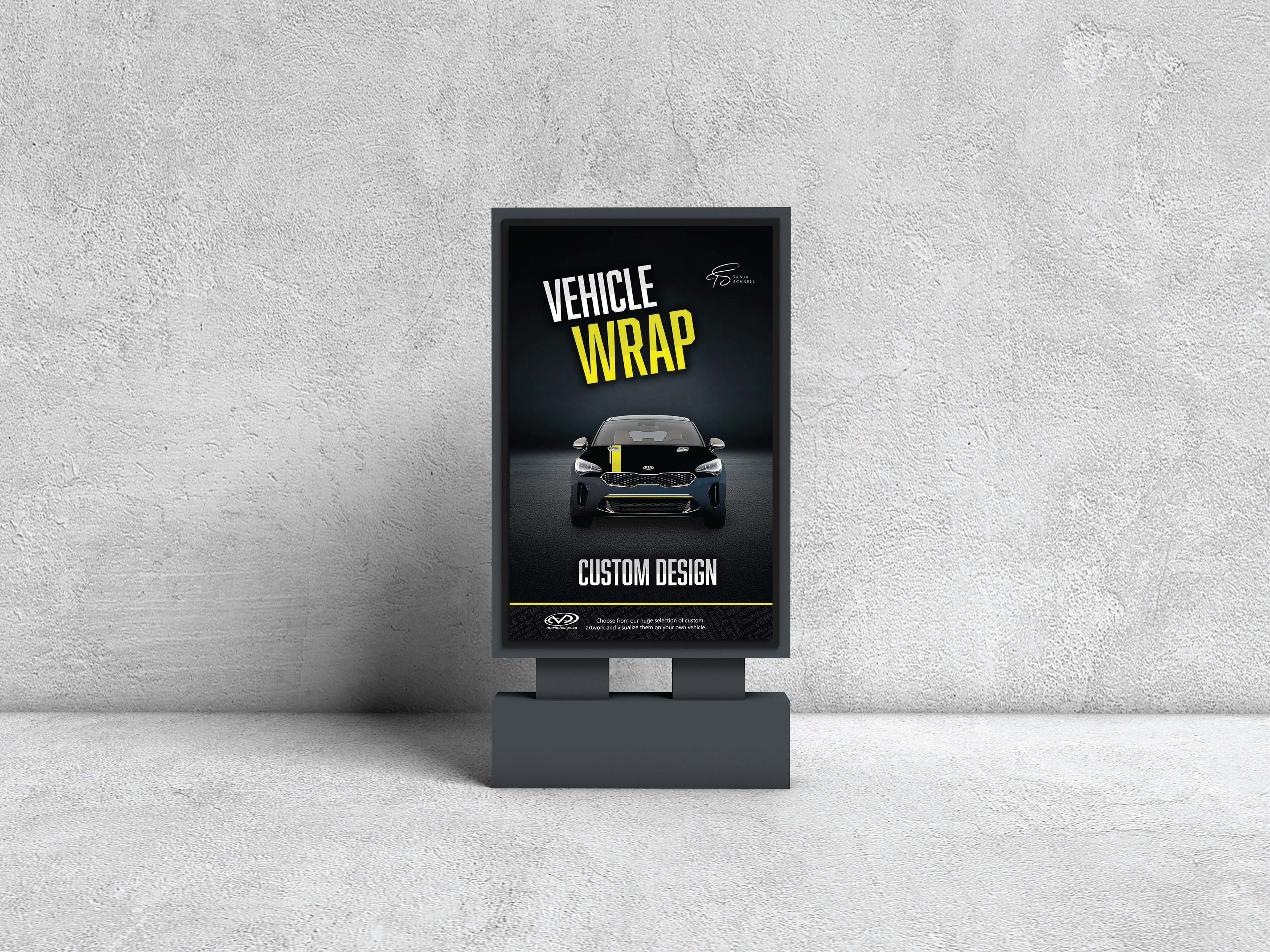
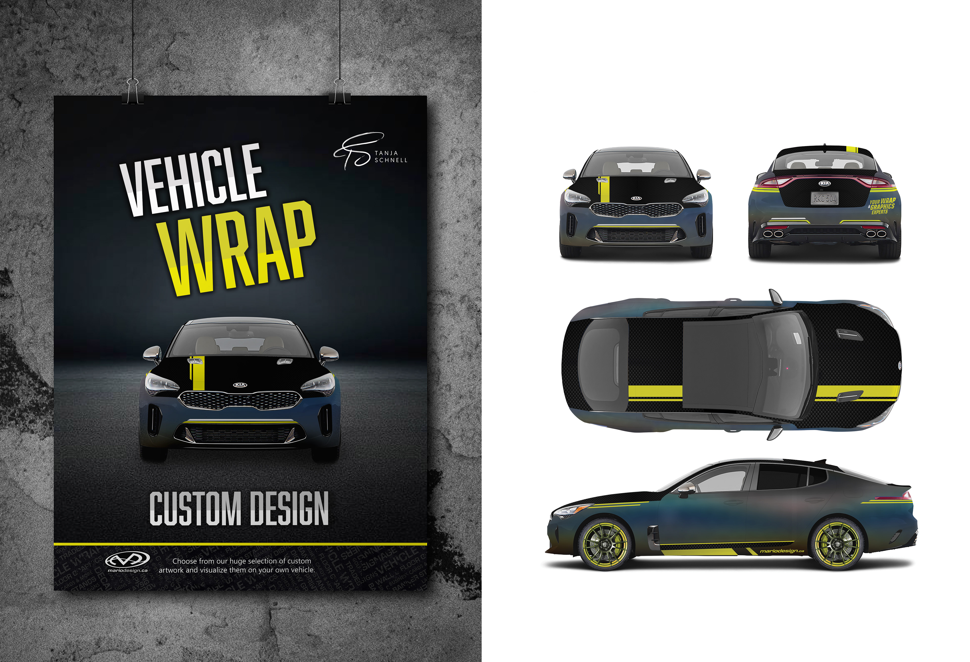
I approached this project by keeping everything quite simple, so the new vinyl would really grab all the attention. Therefore, I didn't use lots of different shapes and colours, but instead decided to go with a textured vinyl, adding another unique and special feature to the car. The bright yellow neon colour was used to emphasize important information such as the website, so it is visible even from far away. Since I only had the actual car wrap as the design element for this project, I really wanted to create a poster for it as well. While the car wrap design without context is a little boring, I really wanted to give the visual that needed emphasize and highlight the service MarioDesign offers, while still keeping the design within the assignment task; presenting it as our design for MarioDesign, therefore promoting both his brand as well as my own design. As for the typeface, I went with Abolition, to maintain this rather technical and vehicle-based theme, for which this geometric typeface works well.